Designing Above the Fold for Your IDX Website

When a prospective buyer or seller lands on your real estate website, you have roughly three seconds to convince them to stay. Before they scroll, before they click, and before they read your biography, they make a subconscious decision about your credibility. This critical first impression happens entirely within the space we call "above the fold."
The term originates from the newspaper industry, referring to the top half of the front page visible on a newsstand. For your integrated IDX website, it refers to everything a visitor sees on their screen before they touch the scroll wheel or swipe down on their phone. If this space fails to engage them, they will simply leave and find another agent.
We know how hard you work to drive traffic to your website. Our goal is to ensure that traffic converts into satisfied clients. This comprehensive guide will explain the importance of your above-the-fold layout, provide modern design strategies, and show you exactly how to structure this premium digital real estate to capture more leads.
Why the Above-the-Fold Section Dictates Your Success
Your website visitors arrive with a specific intention. They want to find a new home, discover the value of their current property, or locate a trustworthy local expert. The top section of your homepage must immediately confirm that they are in the right place.
If a visitor has to hunt for a search bar or dig through menus to find your contact information, you introduce friction. Friction causes frustration, and frustrated users leave. A thoughtfully designed top section removes this friction entirely. It anticipates the client's needs and serves up the exact tools they require the moment the page loads.
By prioritizing a clean, user-centric design, you establish immediate professional credibility. You show potential clients that you respect their time and understand their goals. This solution-oriented approach builds the foundation of trust required for a successful real estate relationship.
Core Elements of High-Converting Top Sections
Designing an effective top section is not about cramming as much information as possible into a small space. It is about strategic curation. The most successful real estate websites in 2026 focus on a few high-impact elements.
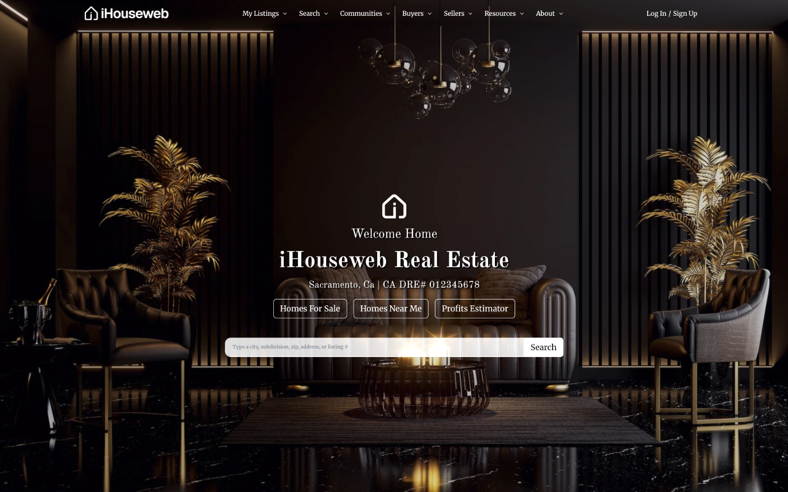
Captivating Visual Backgrounds
Real estate is a highly visual industry. Your background imagery sets the immediate emotional tone for your brand. Use high-resolution, professional photography or a smooth, high-quality video background.
Instead of generic stock photos of keys or handshakes, feature stunning local landmarks, recognizable neighborhoods, or a beautiful property you recently sold. This localized imagery proves you are deeply embedded in the community you serve. It allows visitors to visualize the lifestyle they want to achieve by working with you.
A Clear and Confident Value Proposition
Overlaid on your visual background, you need a powerful headline. This is your value proposition. It should clearly state what you do, who you serve, and how you deliver exceptional results.
Keep it concise. A headline like "Navigating the Denver Market with Confidence" or "Your Expert Guide to Luxury Coastal Living" works perfectly. Below the main headline, include a brief subheadline that reinforces your commitment to customer satisfaction and success. Let them know immediately that you are the solution to their real estate challenges.
The Intuitive IDX Quick Search
The number one reason buyers visit a real estate website is to look at properties. Your IDX quick search tool must be front and center. Do not make users scroll down to begin their property hunt.
Place a clean, prominent search bar directly in the center of the screen, ideally just below your value proposition. Modern search bars should allow users to type in a city, neighborhood, or zip code effortlessly. When you give clients immediate access to the MLS data they crave, you dramatically increase the amount of time they spend on your site.
Prominent and Actionable Calls-to-Action
While buyers want to search, potential sellers might want something else. Your above-the-fold area must include clear Calls-to-Action (CTAs) that guide users toward their specific goals.
Use contrasting colors for your CTA buttons so they stand out against the background. Offer a button for buyers saying "Search New Listings" and a secondary button for sellers offering a "Free Home Valuation." These clear directives eliminate confusion and provide a seamless pathway for visitors to become active leads.
Modern Design Strategies
Technology and user behaviors evolve rapidly. A design that worked five years ago will look outdated and perform poorly today. Implement these modern strategies to keep your digital presence sharp and competitive.
Adopt a Mobile-First Mindset
More than half of all real estate web traffic now comes from mobile devices. If your top section looks beautiful on a desktop computer but breaks on a smartphone, you will lose a massive portion of your audience.
Mobile-first design means building the mobile experience before scaling it up for larger screens. Ensure your text remains legible without zooming, your buttons are large enough to tap easily, and your quick search functions flawlessly on a touchscreen. A seamless mobile experience proves you are a modern, accessible professional.
Prioritize Loading Speed
Search engines and consumers alike demand speed. If your high-resolution background video takes ten seconds to load, the user will be gone before it even starts playing.
Compress your images and utilize efficient coding practices to ensure your site loads almost instantly. A fast-loading site keeps users engaged and signals to search engines that your website provides a high-quality user experience. This technical optimization directly supports your broader lead generation goals.
Simplify Your Primary Navigation
Your main navigation menu lives at the absolute top of the page. It is a critical component of the above-the-fold experience. Keep this menu remarkably simple.
Avoid overwhelming visitors with fifteen different dropdown options. Stick to the essentials: Search, Sell, About, and Contact. A clean, uncluttered navigation bar makes your site feel approachable and helps visitors find the specific solutions they need without unnecessary clicking.
Layout Examples That Drive Results
Different real estate business models require slightly different approaches to homepage design. Here are three effective ways to layout your top section based on your specific goals.
The Search-Centric Layout
This layout is ideal for agents who work primarily with active homebuyers. The entire focus is on the property hunt.
Use a sweeping, bright photo of a popular local neighborhood as the background. Place a large, highly visible IDX search bar right in the middle of the screen. The headline above it should invite them to start exploring. This layout turns your website into a powerful property discovery engine, keeping buyers glued to your platform instead of national portals.
The Agent-Centric Trust Layout
If your business relies heavily on referrals, personal branding, and high-touch service, this layout works best. It focuses on establishing your authority and building a personal connection immediately.
Instead of a full-screen neighborhood photo, use a professional, welcoming image of yourself or your team in a local setting. Place a strong headline highlighting your track record of satisfied clients. Include a prominent button that invites them to "Schedule a Free Consultation." This design humanizes your brand and emphasizes your dedication to personal service.
The Dual-Objective Layout
Many agents need to attract both buyers and sellers equally. The dual-objective layout balances these two distinct audiences perfectly without causing clutter.
Split the primary CTA area into two distinct, side-by-side buttons. One side offers a property search tool, and the other offers an instant home valuation. This highly functional design immediately categorizes your leads, allowing you to deliver a perfectly tailored experience based on what the user clicks.
Establishing Trust Before They Scroll
While sleek design and powerful tools are essential, you must also weave trust signals into the top of your page. Clients need to know you are a real, accessible person.
Ensure your contact information is highly visible. Place your phone number and professional email address in the top right corner of the navigation bar. Even if a visitor does not call you immediately, seeing a real phone number builds immense credibility. It shows you are ready and willing to help.
You can also incorporate a subtle trust signal, such as a small badge highlighting a recent award or a single, powerful five-star review snippet placed just below your main search bar. These small details reassure visitors that they are dealing with a proven expert who consistently delivers exceptional results.
Take Action on Your Website Design
Your website's top section is the most valuable digital real estate you own. It dictates whether a visitor engages with your brand or leaves for a competitor. By focusing on clean design, intuitive search tools, and clear value propositions, you create an environment that naturally fosters client success.
Review your current homepage today. Load it on both your desktop and your smartphone. Does it immediately communicate your value? Is the search bar easy to find? Are your contact details visible? If your above-the-fold area falls short, use these strategies to redesign it. An optimized top section will immediately elevate your brand, capture more leads, and help you grow your real estate business with confidence.
demo and let's discuss how iHouse Elite can help your real estate business.