Catching New Home Buyers With Your Mobile Website
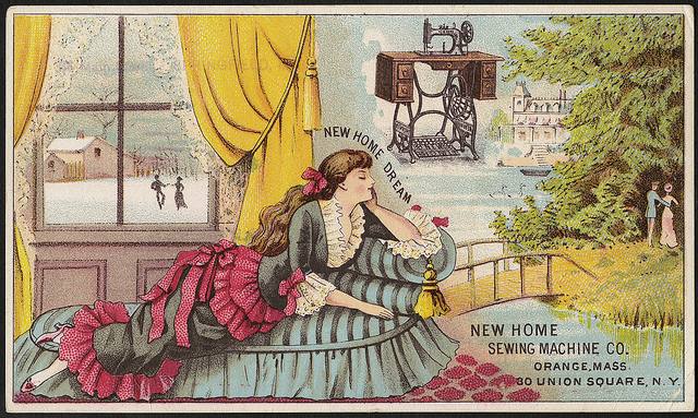
September 30, 2015Of course, “new home buyer” can be taken several ways – someone who wants to buy a new home, or someone who is new to home buying, or younger home buyers, or even someone who wants to buy in a town called New Home… etc. etc. etc. Which is why there’s even more whimsy in the image!
Since more and more home buyers are turning to their smart phones and tablets to look for homes, you want to take advantage of you mobile website to be sure you attract the new home buyer in whatever guise they come.
The National Association of Realtors actually teamed with Google to do a study aimed at better understanding how people using smart phones and tablets approach home buying. Called The Digital House Hunt you can download it here. The research was actually done in 2012 and published in 2015, so the numbers are probably a bit off. The trends aren’t.
Mobile searches just continue to grow
Highlights of interest include:
- 89% of new home shoppers use a mobile search engine at the onset and throughout their research
- Mobile applications are used by 68% of new home shoppers at the onset and throughout their research
What are they looking for?
Obviously they are using their smart phones and tablets to look for real estate. In most cases that means homes. Which is why you’re mobile site is so important. You want to make sure yours is working properly and that you understand the bells and whistles. Feel free to contact us with any questions, please.
Make sure your pictures show the house accurately
You want every home you photograph to look good and you don’t want to disappoint potential buyers with photos that are, well, misleading. You might find 5 Things Not To Do When Taking Real Estate Photos helpful.
You also want to make sure your photos are crisp and clear and display well on smart phones. Since the photos will be small keep the size in mind and don’t try to cram to much into a picture – two or three less crowded photos will work better.
Remember too, that mobile tablets let users view your site both vertically and horizontally. Check your photos in both directions.
Type size needs to be readable
There’s nothing more frustrating for a user than to find the type size is too small to read comfortably. Make sure your type is displaying properly on your site.
White space breaking up blocks of text is probably more important than ever before. That may seem counter intuitive – but the small screen is harder to read than the desktop screen and white space makes it a bit easier on the eye.
Information needs to be current
People who use their smart phones for searching for real estate expect up to the minute information. Make sure your connection to your IDX or multiple listing service posts automatically to your mobile site. This is worth checking at least once a week. Just bring your site up and see what’s happening. Usually it will be fine, but once and a while it won’t be and the quicker you get whatever problem solved. the better.
Many real estate websites need some tweaks as they make the transition to mobile. Make sure your site is easy to read, your pictures look good and your sit is functioning properly. You’ll soon be catching new home buyers whatever their description.
Contact us with questions about your mobile site, or ask them in comments.

By Anne Wayman
Before Anne Wayman became a writer she sold real estate in Southern California. She worked with her father who learned the business from his father. Not surprisingly she learned a few things along the way. Since then, she has been freelance writing for over 30 years – she is a grandmother, loves cats and writes about a wide variety of topics including real estate.

